The Problem
Three years ago, I inherited the Village Capital website. Around the same time, the organization updated its visual identity, but the website didn't fully reflect it yet. Similar sections had been built in different ways, spacing, colors, and typography were inconsistent, and simple content changes often required engineering support.
This became increasingly difficult to maintain because Village Capital launches new accelerator programs regularly, and each program needs its own landing page, sometimes with different necessities to display content.
Without a shared system, every new page added more complexity to the website.
My Role
For the last three years, I've been responsible for the frontend architecture and ongoing evolution of the website.
The designer provided the visual guidelines, and I translated them into a reusable Design System that could scale across the platform.
My work included:
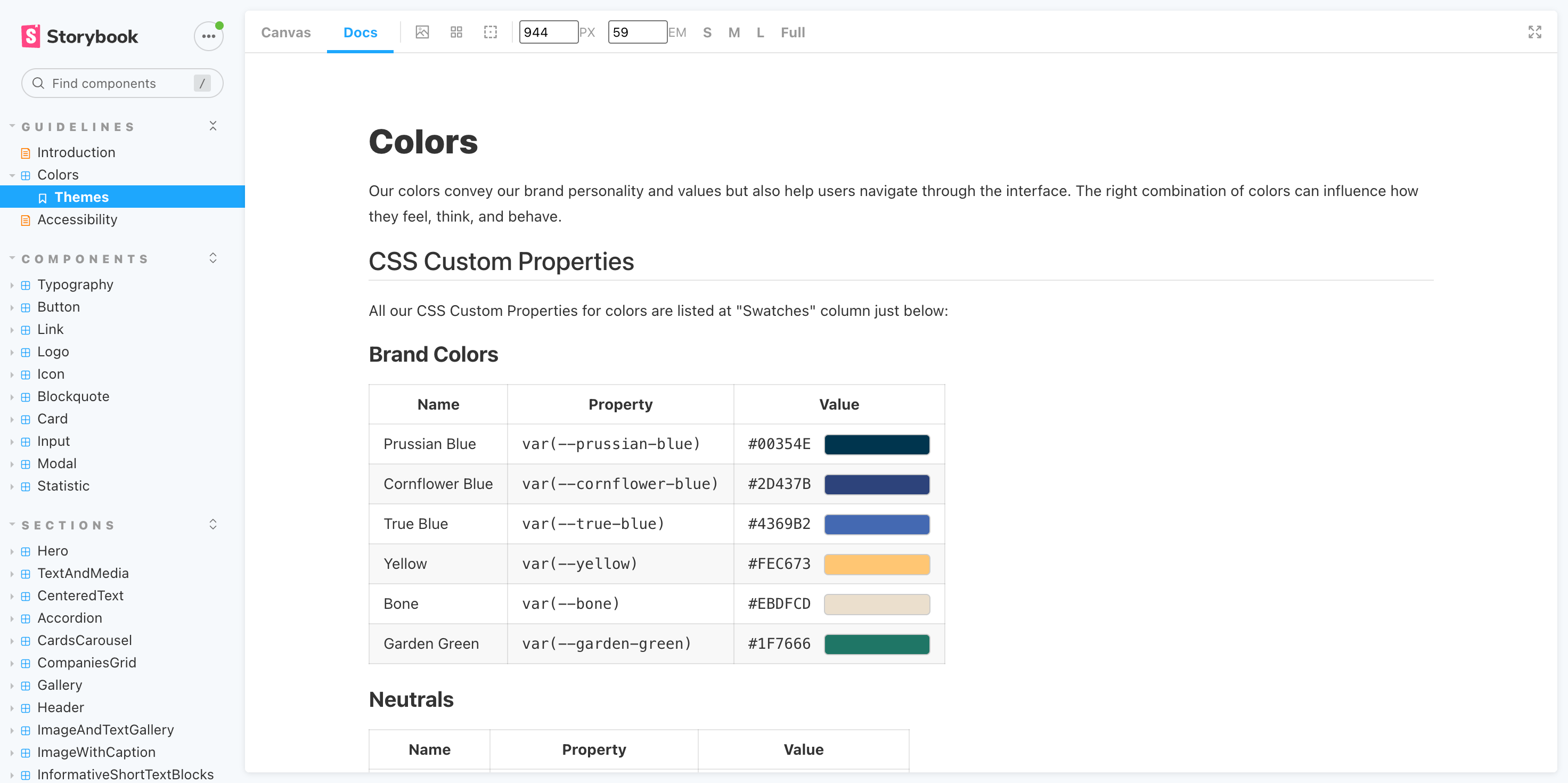
- Defining typography, colors, spacing, themes, and responsive behavior
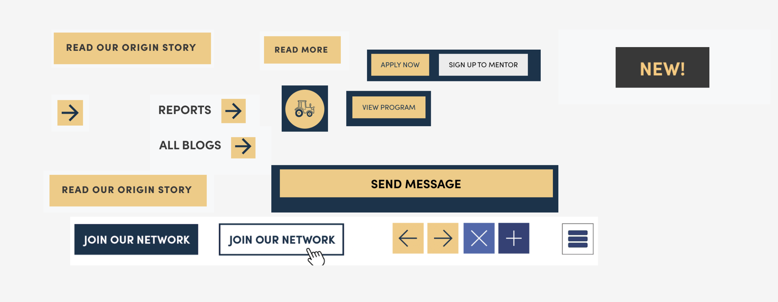
- Building reusable UI components
- Designing CMS-driven page structures
- Maintaining and extending the Design System over time
- Refactoring existing pages into reusable patterns
The Solution
Instead of redesigning individual pages, I focused on creating a Design System that could gradually be adopted across the website.
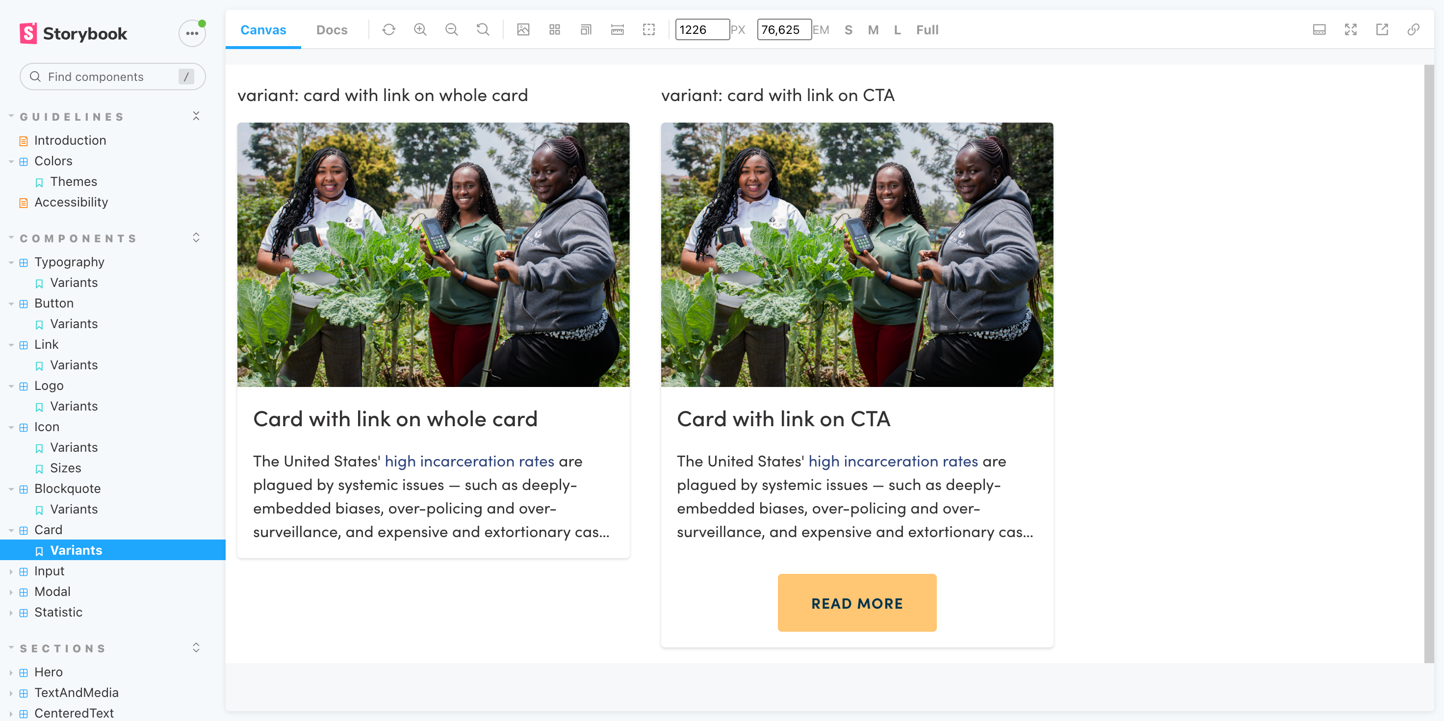
I built a collection of reusable components that could be configured through Contentful, allowing non-technical teams to create and manage content without needing engineering support.
The system includes:
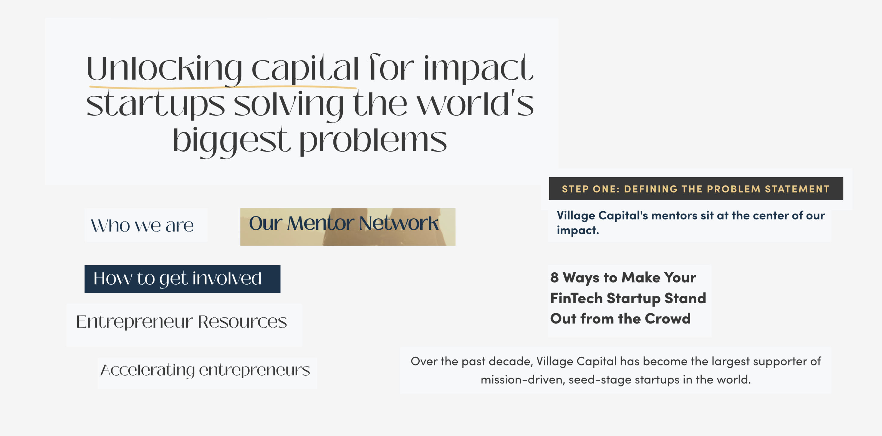
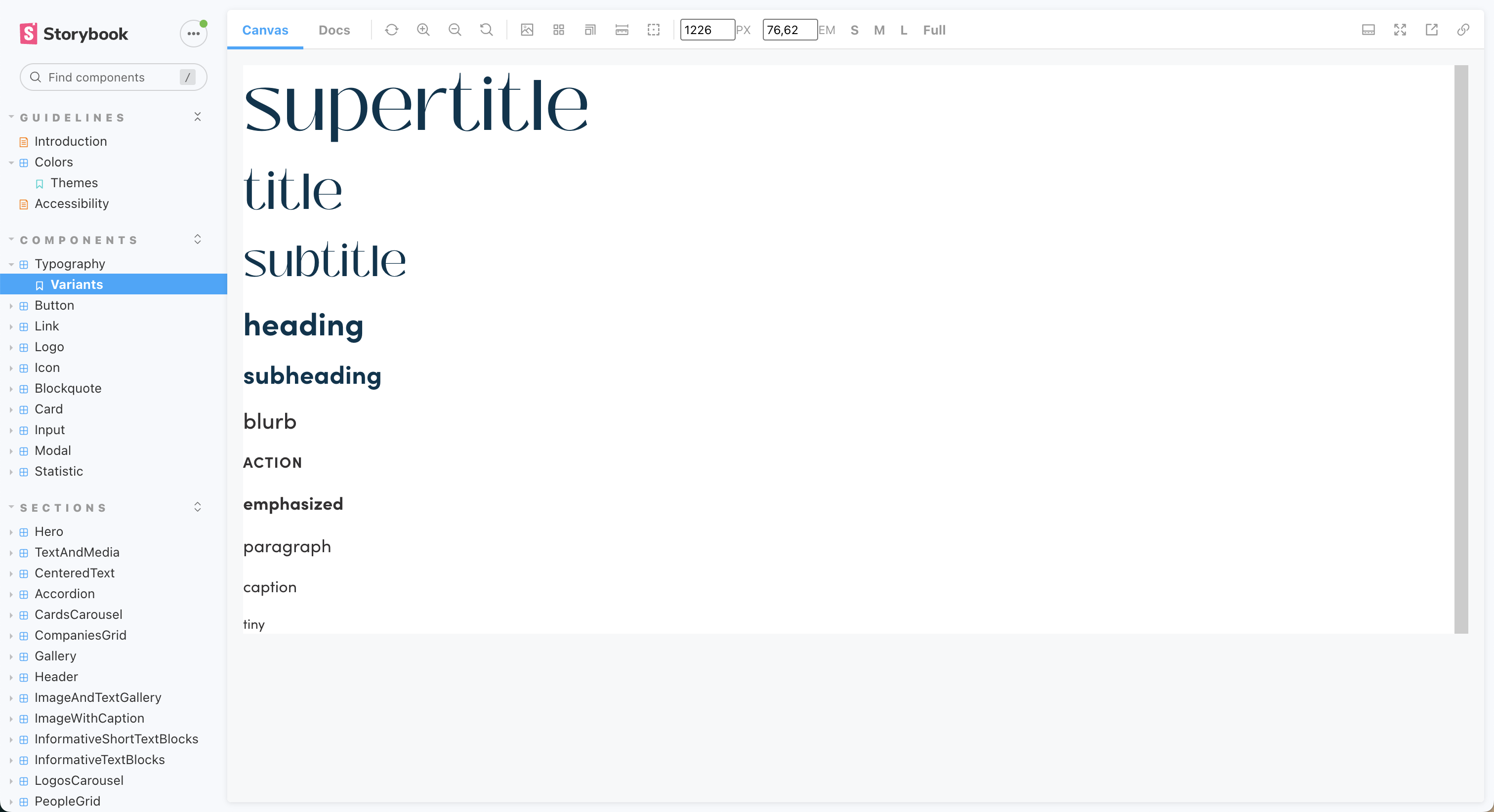
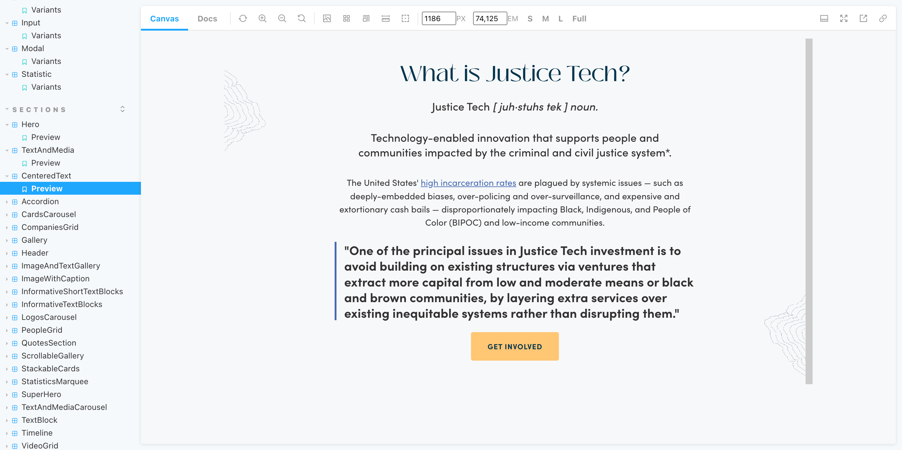
- Typography and spacing scales
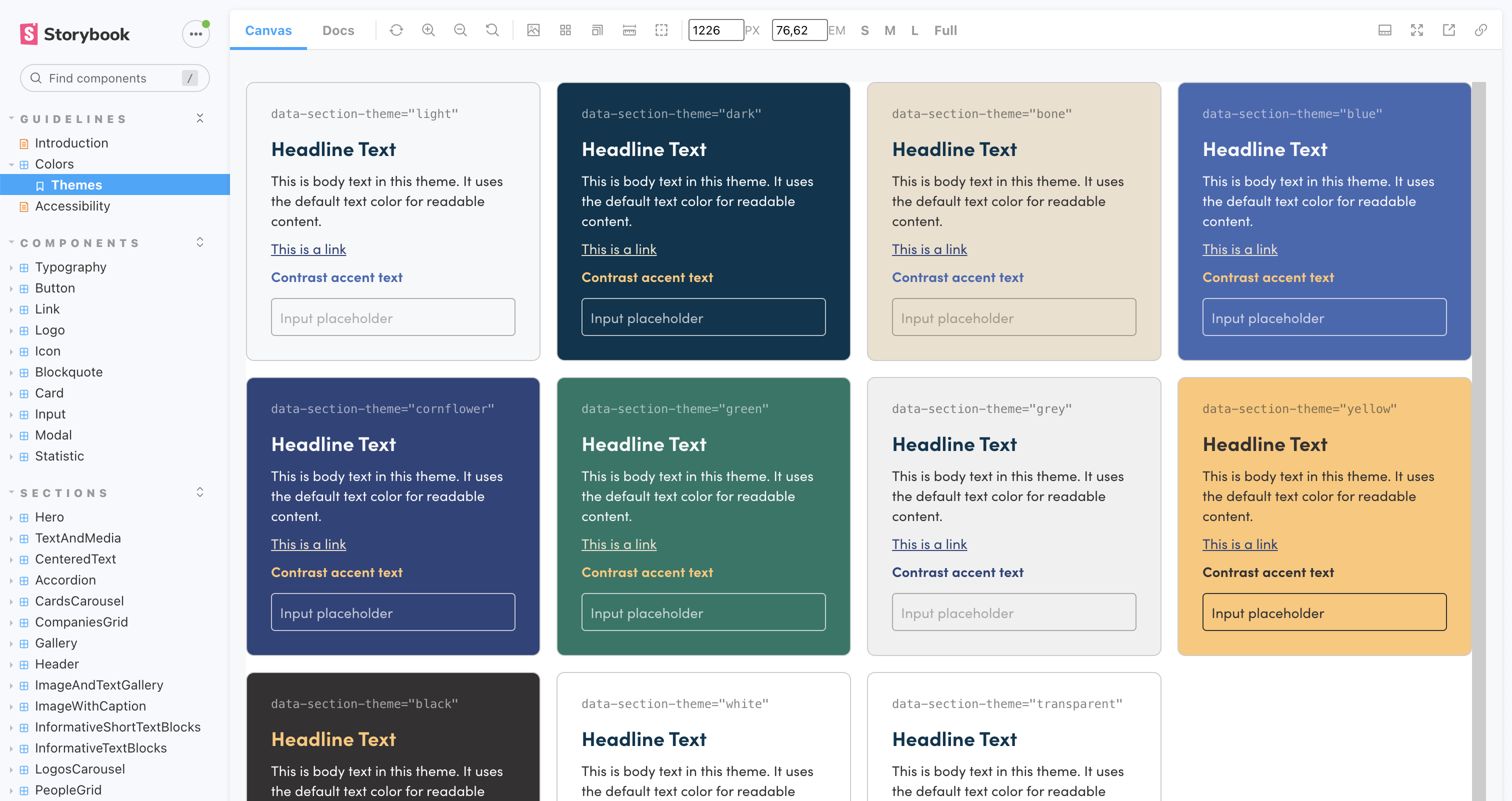
- Theme-based styling
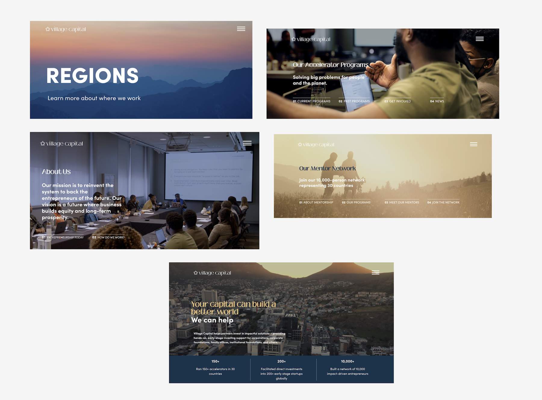
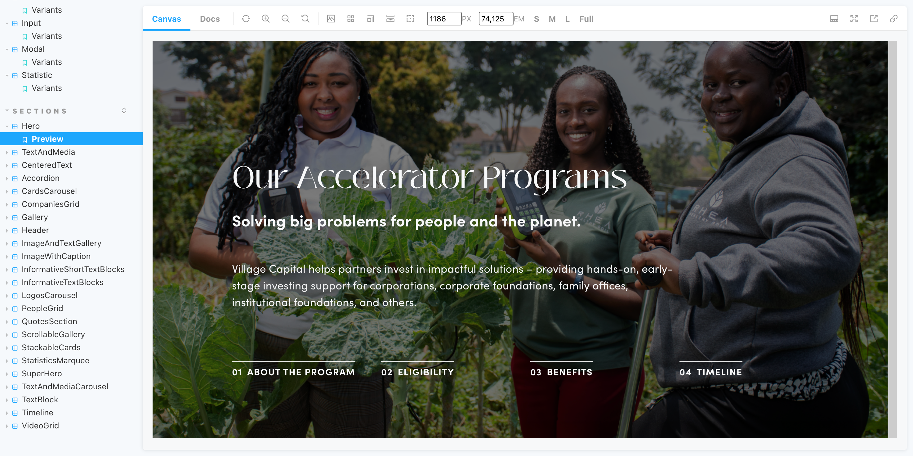
- Hero sections
- Galleries
- Timelines
- Cards
- Carousels
- Video embeds
- Interactive content blocks
One of the principles I followed was keeping content creation flexible while limiting unnecessary design decisions.
For example, instead of allowing editors to configure individual colors for backgrounds, text, and buttons, they simply select a theme and the Design System handles the rest.
Challenges
The most interesting challenge was balancing flexibility and consistency.
Program teams often needed new ways to present information, whether that meant displaying more images, embedding videos, or introducing entirely new content structures.
The challenge wasn't building new components. It was making sure those components could solve new problems without creating a completely different visual language each time.
Refactoring
A large part of the work involved identifying duplicate patterns and consolidating them into reusable components.
Some examples include:
- 5 hero implementations consolidated into 1 configurable component
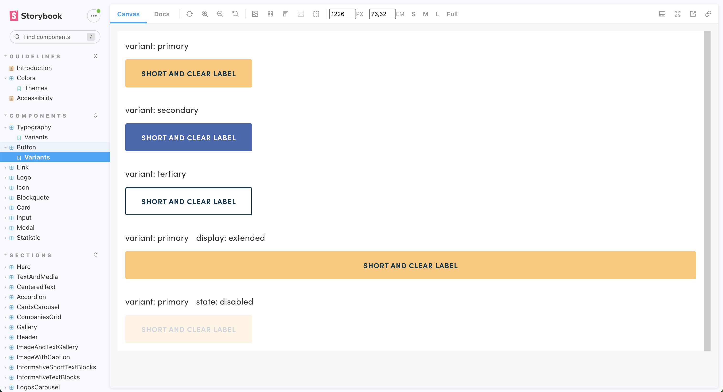
- 6 button variants merged into a single flexible button component
- Multiple typography styles replaced with a shared type scale
- Different gallery implementations merged into one reusable gallery
- Multiple timeline and form designs standardized into common patterns
Impact
Today, marketing and program teams can create and manage content directly through Contentful without developer involvement.
They can build program pages using a flexible set of components while maintaining a consistent visual identity.
The website now benefits from:
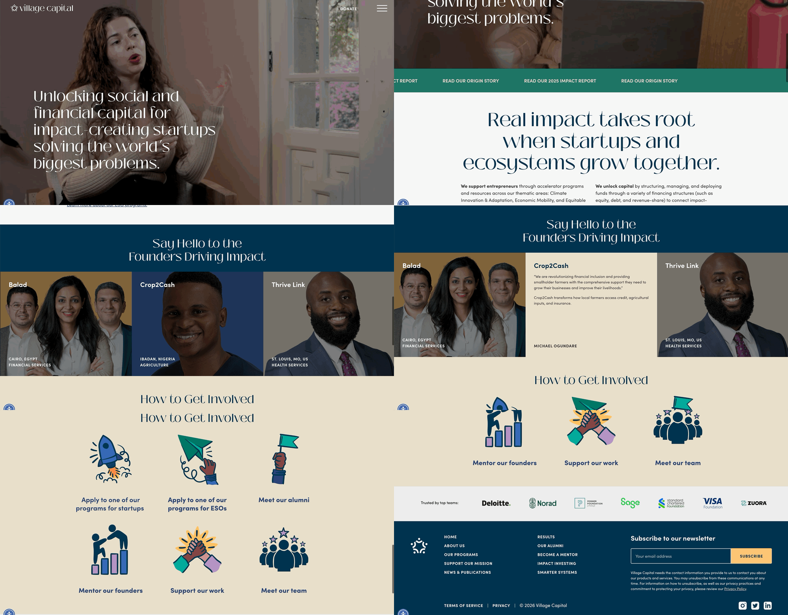
- A stronger and more cohesive visual identity
- Better readability and accessibility
- Reduced engineering involvement for content updates
- Faster page creation for new programs
- A Design System that continues to scale after three years of use
What I Learned
This project taught me that flexibility is most valuable when it comes with clear boundaries.
Giving content creators unlimited options often creates inconsistency and decision fatigue. Giving them the right set of options creates a better experience for everyone.
It also reinforced the importance of involving the people who create content in the design process. Understanding how they work helped shape a system that is not only maintainable from an engineering perspective, but also genuinely useful for the teams using it every day.
The thing I'm most proud of is that the system is still working years later. New programs, new content, and new requirements continue to fit into the framework without turning the website into a collection of one-off solutions.